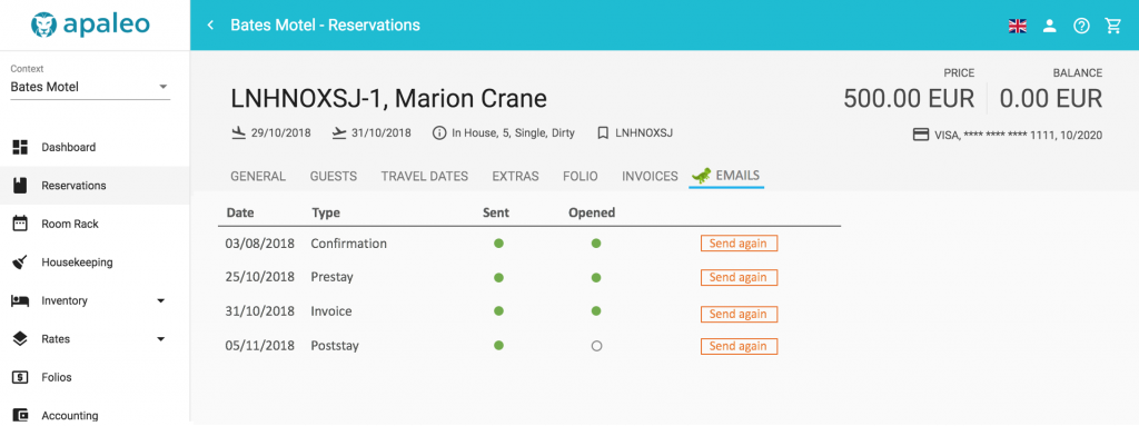
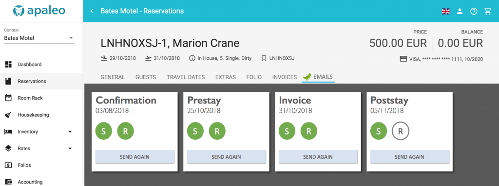
The looks
We would recommend to develop your apaleo UI snippet as a separate page, and not just include a page or view from your product. That way you can style it differently, and optimize the content. The downside is that it might be out of sight and out of mind, and break without you noticing. Make sure to include it in your tests.
| apaleo style | your style |
|---|---|
 |
 |
Make it clearly visible, that this is your content and not apaleo’s. You should get the fame for what you built – and the support tickets, too.
The apaleo UI is responsive, and works from phones to giant screen. Many hotels still have old and
non-high-res screens standing around, take that into account when designing and building your UI. As
font, we use Roboto, background is white, text is black and sentence case. We usually don’t do bold,
italic or all-caps. Our brand new branding is using #363942 (grey), #5C832E (green), #382513
(brown), #D9CBA8 (sand), #2C8693 (blue) and #F19721 (orange), where the last one is the
primary color for buttons. The layout is Material design-ish, and we also
use their icons.
You don’t have to use the same style as we do, but we think the users would be happy, if it is not looking completely different.